This post is a continuation of the series initiated here.
Recall our problem imagines we are a bank lending to the largest 1,000 US companies. We (“Bank1000”) own the debt of these companies and are required to prepare IFRS9 disclosures. This requires the estimation of an expected credit loss (“ECL”) and risk stage.
We have already selected the top 1,000 stocks for analysis, we now need to create an ECL balance and assign a risk stage.
The ECL is a probability weighted estimate of credit losses. The risk stage takes three values and indicates whether a loan has had no change in credit risk since origination (Stage 1), has experienced a significant increase in credit risk since origination (Stage 2) or if the loan is credit impaired (Stage 3). We are going to estimate the expected credit loss and risk stage via measurements of valuation and default risk. We do not know the level of credit risk at origination, so the risk stage will be assigned based on the current level of credit risk as opposed to the change since origination.
Stocks that have a low valuation and/or a high default risk will attract a higher estimated expected credit loss. High default risk is obviously a natural proxy for expected credit loss, the ECL is designed to reflect default risk. Low valuation will also proxy credit risk on the basis that should a stock be trading at a significant discount to it’s peers, it is likely to be experiencing heightened credit risk.
How will valuation and default risk be assessed? Valuation will be assessed using the Price/Book - Return on Equity (“PB-ROE”) model. Default risk will be assessed using the using the Merton distance to default model. Both of these methods will be explained in further detail below. It should be noted that the PB-ROE model will be applied to groups of similar stocks. The similarity of stocks is not going to be assessed via industry or sector membership, but rather by similarity of fundamental characteristics. This will be determined by applying a clustering algorithm.
This is all going to take some significant data engineering. In broad terms this will look as follows:
- Create financial ratio attributes required for subsequent modelling steps
- Assign stocks to like groups based on financial characteristics via a clustering algorithm
- Assign cluster membership labels to stocks and fill forward cluster label to next assessment date
- For each date and cluster, fit the PB-ROE model and rank stocks based on resultant valuation
- Apply the Merton distance to default model and rank stocks by distance to default
- Combine the rankings of the valuation and default models, and assign an ECL and risk stage
Let’s get started loading the required packages.
library("tidyverse")
library("broom")
library("modelr")
library("RcppRoll")
library("lubridate")
library("tibbletime")
library("scales")
library("tidyquant")
library("DescTools")
library("ggplot2")
library("ggiraphExtra")
library("kableExtra")
library("summarytools")
library("data.table")
library("DT")
library("widgetframe")
library("htmltools")
library("feather")
Next, we read in the Simfin raw data and create the market capitalisation attribute and market capitalisation cut-offs. This is the same initial step that was performed in the prior post.
simfin <- fread("C:/Users/brent/Documents/R/R_import/output-comma-narrow.csv") %>%
  rename_all(list(~str_replace_all(., " ", "."))) %>%
  rename(Industry = Company.Industry.Classification.Code) %>%
  mutate(publish.date = as_date(publish.date)) %>% as_tibble()

# Market cap construction
mkt.cap <- simfin %>% filter(Indicator.Name %in% c("Book to Market", "Total Equity")) %>%
  mutate(Indicator.Name = str_replace_all(Indicator.Name," ",""),
         me.date = ceiling_date(publish.date, unit = "month") - 1) %>%
  spread(Indicator.Name, Indicator.Value) %>%
  mutate(mkt.cap = abs(TotalEquity) / Winsorize(abs(BooktoMarket), minval = 0.1, maxval = 3)) %>%
  filter(is.finite(mkt.cap)) %>%
  complete(me.date = seq(as.Date("2008-01-01"), as.Date("2019-01-01"), by = "month") - 1, Ticker)   %>% group_by(Ticker) %>% fill(mkt.cap) %>% ungroup() %>%
  select(Ticker, me.date, TotalEquity, BooktoMarket, mkt.cap)

# Market capitalisation cut-offs
mkt.cap.filter <- mkt.cap %>% filter(!is.na(mkt.cap)) %>% nest(-me.date) %>%
  mutate(thousandth     = map(data, ~nth(.$mkt.cap, -1000L, order_by = .$mkt.cap)),
         eighthundredth = map(data, ~nth(.$mkt.cap, -800L, order_by = .$mkt.cap)),
         sixhundredth   = map(data, ~nth(.$mkt.cap, -600L, order_by = .$mkt.cap)),
         fourhundredth  = map(data, ~nth(.$mkt.cap, -400L, order_by = .$mkt.cap)),
         twohundredth   = map(data, ~nth(.$mkt.cap, -200L, order_by = .$mkt.cap))) %>%
  filter(me.date > "2012-12-31") %>% select(-data) %>% unnest()
Step 1 - Create financial ratio attributes required for subsequent modelling steps
The code block below prepares the data required to perform the clustering. Financial ratio attributes are created and market capitalisation filtering applied. This will result in a data frame containing a monthly time series of fundamental data attributes (and ratios derived therefrom), for the top 1,000 US stocks by market capitalisation.
# Prepare data for clustering algorithm

# Fundamental data - filter attributes and dates required
simfin.m <- simfin %>% filter(Indicator.Name %in% c("Book to Market", "Total Equity", "Long Term Debt", "Short term debt", "Enterprise Value", "Total Assets", "Intangible Assets", "Revenues", "Net Profit", "Total Noncurrent Assets", "Total Noncurrent Liabilities", "Depreciation & Amortisation", "Net PP&E") & publish.date > "2011-12-31") %>%
  mutate(Indicator.Name = str_replace_all(Indicator.Name, c(" " = "", "&" = "")),
         me.date = ceiling_date(publish.date, unit = "month") - 1) %>%
  spread(Indicator.Name, Indicator.Value) %>%

  # Establish time index
  as_tbl_time(index = publish.date) %>%

  # Group and remove Tickers with insufficient days data to satisfy rolling function
  group_by(Ticker) %>% mutate(date_count = n()) %>%
  ungroup() %>% filter(date_count > 3, !Ticker == "") %>% group_by(Ticker) %>%

  # Quarterly to annual aggregation for P&L line times
  mutate(ann.Revenues = roll_sum(Revenues, n = 4, na.rm = TRUE, align = "right", fill = NA),
         ann.NetProfit = roll_sum(NetProfit, n = 4, na.rm = TRUE, align = "right", fill = NA),
         ann.DepAmt = roll_sum(DepreciationAmortisation, n = 4, na.rm = TRUE, align = "right", fill = NA),
         dlt.Revenues = log(Revenues / lag(Revenues, 4)),
         vol.Revenues = roll_sd(dlt.Revenues, n = 8, na.rm = TRUE, align = "right", fill = NA)
         ) %>%
  ungroup() %>%

  # Create attributes for ingestion to clustering algorithm
  mutate(TotalDebt = LongTermDebt + Shorttermdebt,
     mkt.cap = abs(TotalEquity) / Winsorize(abs(BooktoMarket), minval = 0.1, maxval = 3),
     td.ta   = TotalDebt / TotalAssets,
     ncl.ta  = TotalNoncurrentLiabilities / TotalAssets,
     nca.ta  = TotalNoncurrentAssets / TotalAssets,
     int.ta  = IntangibleAssets / TotalAssets,
     oa.ta   = (TotalNoncurrentAssets - NetPPE) / TotalAssets,
     rev.ta  = ann.Revenues / TotalAssets,
     np.ta   = ann.NetProfit / TotalAssets,
     da.ta   = ann.DepAmt / TotalAssets,
     rev.vol = vol.Revenues) %>%

  # Join market cap data cut-off points and filter
  left_join(mkt.cap.filter) %>% filter(mkt.cap >= thousandth) %>%

  # Pad time series for all month end dates and fill attribute values
  complete(me.date = seq(as.Date("2012-01-01"), as.Date("2019-01-01"), by = "month") - 1, Ticker) %>%

  # Fill forward post attribute creation
  group_by(Ticker) %>% fill(everything(), -Ticker) %>% ungroup() %>%

  # Filter any record with an attribute returning NA
  drop_na()
Summary statistics and a density plot of the financial ratios to be used for clustering are returned below. Note that this data covers all dates. When the clustering algorithm is applied it will be done so to the stock data at a specific date. The output below can be considered an initial exploratory data analysis to determine if the data is fit for ingestion to the clustering process.
# View summary statistics
simfin.m %>% select(td.ta:rev.vol) %>%
  descr(style = "rmarkdown") %>%
  round(2) %>%
  datatable(
      options = list(pageLength = 15),
      caption = tags$caption(
      style = 'caption-side: bottom; text-align: left;',
      em(
        'Financial ratio legend:', tags$br(),
        'da.ta: Depreciation & amortisation / total assets', tags$br(),
        'int.ta: Intangibles / total assets', tags$br(),
        'nca.ta: Non-current assets / total assets', tags$br(),
        'ncl.ta: Non-current liabilities / total assets', tags$br(),
        'np.ta: Net profit / total assets', tags$br(),
        'oa.ta: Other assets / total assets', tags$br(),
        'rev.ta: Revenue / total assets', tags$br(),
        'td.ta: Total debt / total assets', tags$br(),
        'rev.vol: Revenue volatility'
         )
      ),
      escape = FALSE
  )
A note about table formatting 1.
# Plot density graph
simfin.m %>%
  select(td.ta:da.ta) %>% gather(ratio, value) %>%
  ggplot(aes(x = value)) +
  geom_density() +
  facet_wrap(~ ratio, scales = "free") +
  labs(title = "Financial attribute density plot",
       caption = "Source: SimFin bulk data download - October 2018 (https://simfin.com/)") +
  theme_grey() +
  theme(axis.title.x = element_blank(),
        axis.title.y = element_text(color = "darkslategrey"),
        plot.caption = element_text(size = 9, color = "grey55"))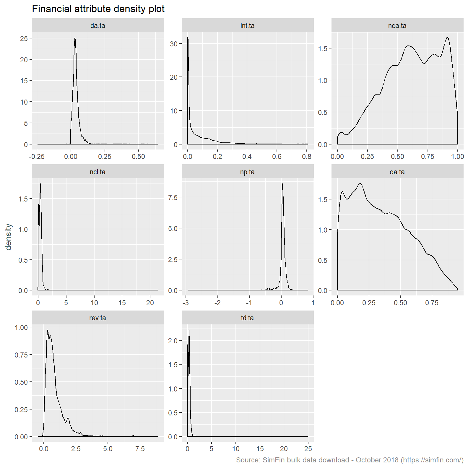
Inspection of the histograms and summary statistic show a number of issues with this data that need to be addressed before proceeding:
Depreciation & amortisation / total assets, non-current liabilities / total assets and revenue / total assets are all returning negative values. This indicates data quality issues. Neither the numerators or denominator of these ratios can take a negative value. We will attempt to resolve this by winsorising the data.
Intangibles / total assets appears to be a low variance predictor. This attribute is returning mostly nil values. The minimum and first quartile value are both nil. A quick review of a couple of Tickers known to have intangibles (A - Agilent, AAPL - Apple, NFLX - Netflix) shows that this data attribute is missing. We will ignore this attribute and take Other assets / total assets as a proxy for the quantum of intangibles. This is appropriate since Intangible assets is a component of Other assets.
A number of attributes are highly skewed. We intend to apply k-means clustering. The k-means clustering algorithm does not perform well on skewed data since cluster centres are derived by taking the average of all data points. Outliers present in skewed data sets unduly influence the cluster centres resulting in less then representative clusters. See here for a nice explanation of this effect. Should the winsorisation of attributes not resolve the skewness we may need to performing a Box-Cox or log transformation.
The attributes we have used are on different scales. Although most attributes are expressed relative to total assets, profit and loss items are naturally on a different scale to balance sheet items. Revenue volatility is on a separate scale altogether. The use of attributes with differing scales is not appropriate for ingestion to the k-means clustering algorithm. This is because one attribute can dominate others should it have greater dispersion. The answers and visualisation in this Stack Overflow question intuitively explain this effect. In light of this we will centre and scale the data.
# View summary statistics
simfin.m %>% select(td.ta:rev.vol, -int.ta) %>%
  mutate_all(list(~Winsorize(.,probs = c(0.01, 0.99), na.rm = TRUE))) %>%
  mutate_all(list(~scale(.))) %>% round(2) %>%
  descr(style = "rmarkdown") %>% round(2) %>%
  datatable(
      options = list(pageLength = 15),
      caption = tags$caption(
        style = 'caption-side: bottom; text-align: left;',
        em(
           'Financial ratio legend:', tags$br(),
           'da.ta: Depreciation & amortisation / total assets', tags$br(),
           'int.ta: Intangibles / total assets', tags$br(),
           'nca.ta: Non-current assets / total assets', tags$br(),
           'ncl.ta: Non-current liabilities / total assets', tags$br(),
           'np.ta: Net profit / total assets', tags$br(),
           'oa.ta: Other assets / total assets', tags$br(),
           'rev.ta: Revenue / total assets', tags$br(),
           'td.ta: Total debt / total assets', tags$br(),
           'rev.vol: Revenue volatility'
           )
    ),
    escape = FALSE
  )
# Plot density graph
simfin.m %>%
select(td.ta:rev.vol, -int.ta) %>%
mutate_all(list(~Winsorize(.,probs = c(0.01, 0.99), na.rm = TRUE))) %>%
mutate_all(list(~scale(.))) %>%
gather(ratio, value) %>%
ggplot(aes(x = value)) +
geom_density() +
facet_wrap(~ ratio, scales = "free") +
labs(title = "Financial attribute density plot",
caption = "Source: SimFin bulk data download - October 2018 (https://simfin.com/)") +
theme_grey() +
theme(axis.title.x = element_blank(),
axis.title.y = element_text(color = "darkslategrey"),
plot.caption = element_text(size = 9, color = "grey55"))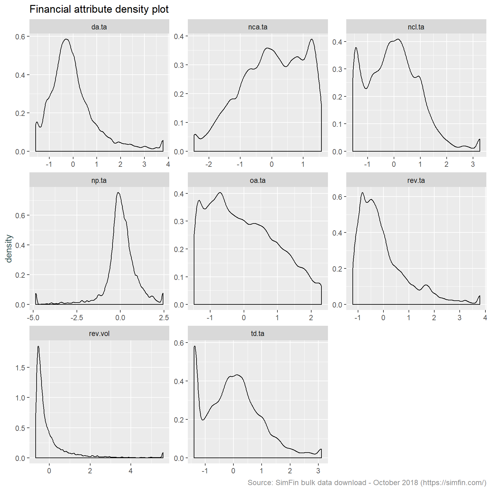
This provides us with a data set that is more appropriate for clustering. Some further observations:
- Revenue volatility remains highly skewed. We will take the log transform of this attribute to resolve this.
- The Total debt over assets (“td.ta”) and Non-current liabilities / total assets (“ncl.ta”) attributes both have a bi-modal distribution. This is a feature of the data in that a specific cohort of stocks will have no debt.
- It’s also worth noting the co-efficient of variation is now meaningless since the mean is nil after centering the data.
# View summary statistics
simfin.m %>% select(td.ta:rev.vol, -int.ta) %>%
  mutate(rev.vol = log(rev.vol)) %>%
  mutate_all(list(~Winsorize(.,probs = c(0.01, 0.99), na.rm = TRUE))) %>%
  mutate_all(list(~scale(.))) %>% round(2) %>%
  descr(style = "rmarkdown") %>% round(2) %>%
  datatable(
      options = list(pageLength = 15),
      caption = tags$caption(
      style = 'caption-side: bottom; text-align: left;',
      em(
        'Financial ratio legend:', tags$br(),
        'da.ta: Depreciation & amortisation / total assets', tags$br(),
        'int.ta: Intangibles / total assets', tags$br(),
        'nca.ta: Non-current assets / total assets', tags$br(),
        'ncl.ta: Non-current liabilities / total assets', tags$br(),
        'np.ta: Net profit / total assets', tags$br(),
        'oa.ta: Other assets / total assets', tags$br(),
        'rev.ta: Revenue / total assets', tags$br(),
        'td.ta: Total debt / total assets', tags$br(),
        'rev.vol: Revenue volatility'
         )
      ),
      escape = FALSE
  )
# Plot density graph
simfin.m %>%
#filter(me.date == '2013-10-31') %>%
select(td.ta:rev.vol, -int.ta) %>%
mutate(rev.vol = log(rev.vol)) %>%
mutate_all(list(~Winsorize(.,probs = c(0.01, 0.99), na.rm = TRUE))) %>%
mutate_all(list(~scale(.))) %>%
gather(ratio, value) %>%
ggplot(aes(x = value)) +
geom_density() +
facet_wrap(~ ratio, scales = "free") +
labs(title = "Financial attribute density plot",
caption = "Source: SimFin bulk data download - October 2018 (https://simfin.com/)") +
theme_grey() +
theme(axis.title.x = element_blank(),
axis.title.y = element_text(color = "darkslategrey"),
plot.caption = element_text(size = 9, color = "grey55"))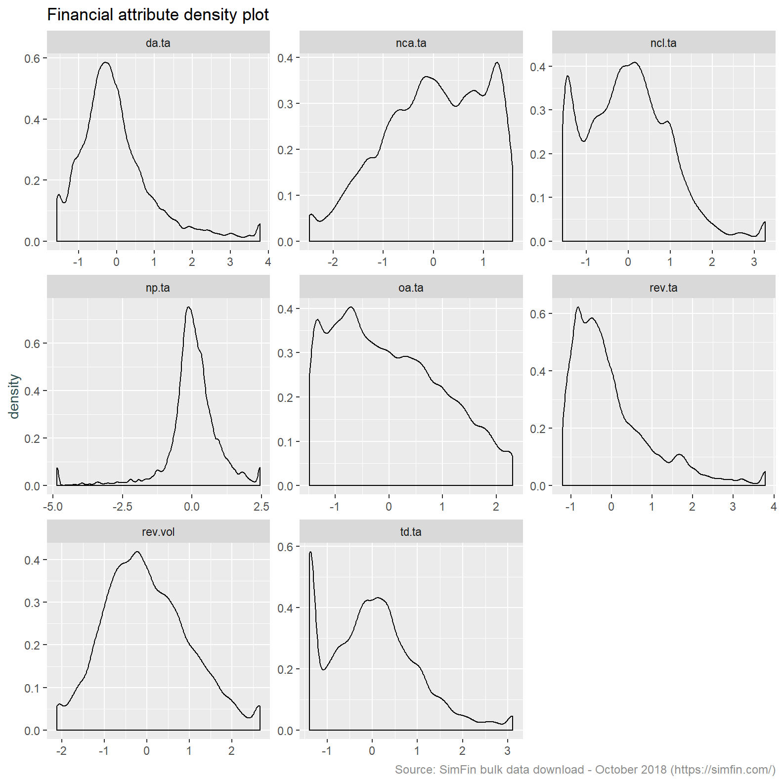
Okay, that looks pretty good. We could perform further transformations, chapter 3 of Applied Predictive Modelling is a good place to review the methods available, however for our purposes we will proceed as is.
Step 2 - Assign stocks to like groups based on financial characteristics via a clustering algorithm
Stocks are traditionally assigned to similar groups via industry or sector membership. We are going to take a different approach and group stocks in an unsupervised manner. We will use a k-means clustering algorithm to cluster stocks based on financial characteristics.
Why not just use industry membership? Industry membership can be subjective and may change over time with a lag. The use of financial ratios is quantitative and will be updated with current information.
With that in mind, we need to assess the optimal number of clusters to use in the k-means algorithm. The code below is taken from this broom package vignette. This uses both the broom and purrr packages to iteratively perform k-means clustering with different values of k, the number of clusters.
The output of the code block below is a graph of the total within-cluster sum of squares versus a range of values for k. Within-cluster sum of squares is of interest since this is the metric the k-means algorithm seeks to minimise. Lower within-cluster sum of squares corresponds to lower with-in cluster variation. This means that the members of the cluster are more alike and the clusters are therefore more different.
Note that we now select data at a specific date.
# Create dataframe for clustering
simfin.cl <- simfin.m %>% filter(me.date == '2014-01-31') %>%
  select(td.ta:rev.vol, -int.ta) %>%
  mutate(rev.vol = log(rev.vol)) %>%
  mutate_all(list(~Winsorize(.,probs = c(0.01, 0.99), na.rm = TRUE))) %>%
  mutate_all(list(~scale(.)))

# K means clustering
kclusts <- tibble(k = 5:50) %>%
  mutate(
    kclust = map(k, ~kmeans(simfin.cl, .x)),
    tidied = map(kclust, tidy),
    glanced = map(kclust, glance),
    augmented = map(kclust, augment, simfin.cl)
  )

clusterings <- kclusts %>%
  unnest(glanced, .drop = TRUE)

assignments <- kclusts %>%
  unnest(augmented)

ggplot(clusterings, aes(k, tot.withinss)) +
  geom_line() +
  ylab("Total within-cluster sum of squares") +
  xlab("k") +
  labs(title = "Financial attribute clustering analysis",
       caption = "Source: SimFin bulk data download - October 2018 (https://simfin.com/)") +
  theme_grey() +
  theme(axis.title.x = element_blank(),
        axis.title.y = element_text(color = "darkslategrey"),
        plot.caption = element_text(size = 9, color = "grey55"))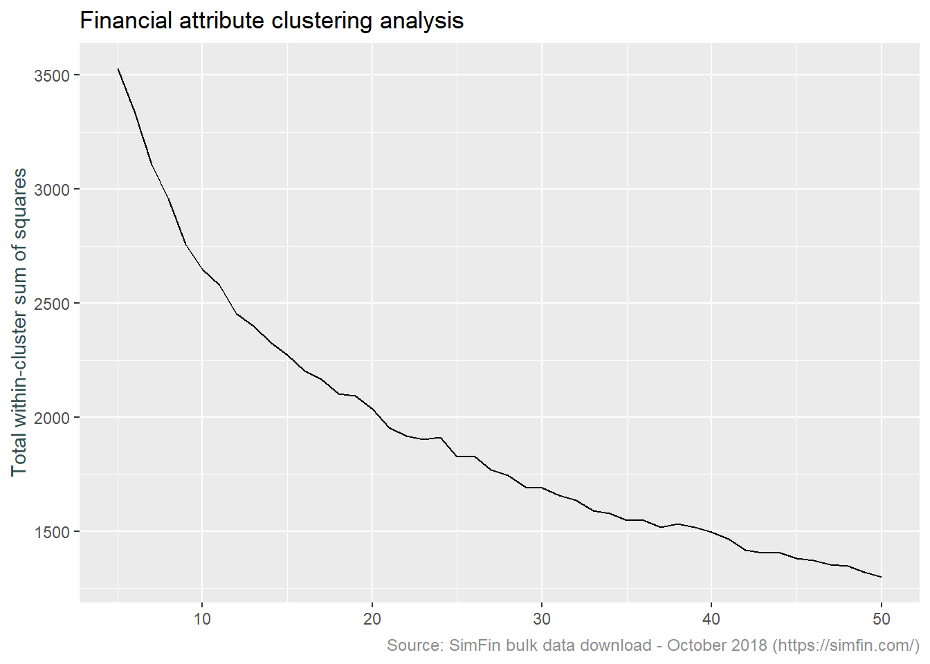
Normally k is selected at the point at which the above plot shows a sharp “elbow”. This is the point at which there is little improvement in the fit of the algorithm as k increases. As can be seen above, there is no sharp elbow to this graph. For convenience sake more than anything else, we will choose 16 clusters for our analysis going forward.
At this point we should note that our clustering technique can miss quiet a bit. If clusters are of unequal size, are of unequal density, or are not spherical, the k-means algorithm is not appropriate. Investigating these details is beyond the scope of what I am trying to achieve with this post. This article provides further detail on these topics.
Lets now visualise our clusters. This code plots the cluster characteristics in a radar plot.
set.seed(123)
kclust16 <- kmeans(simfin.cl, 16, nstart = 25)
kclust16.td <- tidy(kclust16, col.names = c("td.ta", "ncl.ta", "nca.ta",
                                            "oa.ta", "rev.ta", "np.ta", "da.ta", "rev.vol"))
# Create data frame assigning cluster names
kclust16.nm <- kclust16.td %>%
  select(-size, -withinss) %>%
  gather(attribute, clust.avg, -cluster) %>%
  group_by(cluster) %>%
  mutate(clust.rank = rank(clust.avg)) %>%
  summarise(first = attribute[which(clust.rank == 1)],
            second = attribute[which(clust.rank == 2)],
            seventh = attribute[which(clust.rank == 7)],
            eighth = attribute[which(clust.rank == 8)]) %>%
  mutate(clust.name = paste(eighth, seventh, second, first, sep = "_")) %>%
  left_join(kclust16.td, by = "cluster")

# Radar plot of clusters
kclust16.nm %>% select(-size, -withinss, -cluster, -first, -second, -seventh, -eighth) %>%
  ggRadar(aes(group = clust.name), rescale = FALSE, legend.position = "none",
          size = 1, interactive = FALSE, use.label = TRUE, scales = "fixed") +
  facet_wrap(~clust.name, ncol = 5) +
  scale_y_discrete(breaks = NULL) +
  labs(title = "Fundamental cluster characteristics (as at January 2014)",
       subtitle = "Facet title represents two highest and lowest cluster centres",
       caption = "Source: SimFin bulk data download - October 2018 (https://simfin.com)") +
  theme_grey() +
  theme(strip.text = element_text(size = 7),
        legend.position = "none",
        axis.title.x = element_blank(),
        axis.title.y = element_text(color = "darkslategrey"),
        plot.caption = element_text(size = 9, color = "grey55"))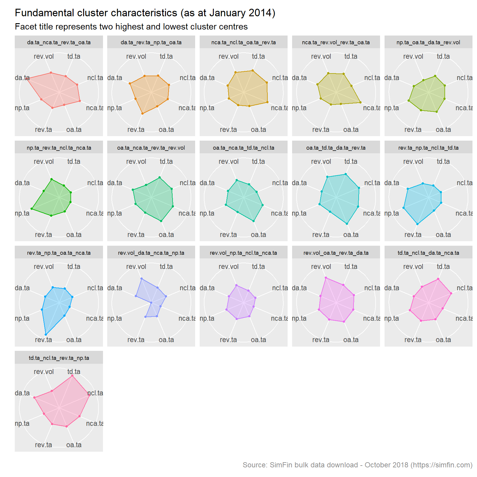
Note that the facet titles are a concatenation of the two highest and two lowest cluster centres. Since our data has been scaled to a unit variance, these are comparable metrics.
Step 3 - Assign cluster label to stocks and fill forward cluster category to next assessment date
We now need to assess cluster membership for specific dates. We will do so on a bi-annual basis. This is done by looping over the fundamental data at the dates required. As mentioned above, clusters are labelled by concatenating the two highest and two lowest cluster centres. The code below returns a data frame listing stocks and their cluster membership by date.
# Looped implementation
set.seed(123)
kclust16.tot = data.frame()
for (i in c('2014-01-31','2014-07-31', '2015-01-31', '2015-07-31', '2016-01-31', '2016-07-31', '2017-01-31', '2017-07-31', '2018-01-31', '2018-07-31')){
  # Prepare data
  x.simfin.cl <- simfin.m %>% filter(me.date == i) %>%
    select(Ticker, me.date, SimFin.ID, td.ta:rev.vol, -int.ta) %>%
    # SimFin.ID converted to character so as to exclude from mutate_if is.numeric
    mutate(SimFin.ID = as.character(SimFin.ID), rev.vol = log(rev.vol)) %>%
    mutate_if(is.numeric, list(~Winsorize(.,probs = c(0.01, 0.99), na.rm = TRUE))) %>%
    mutate_if(is.numeric, list(~scale(.)))

  # Apply k-means
  x.kclust16 <- kmeans(select(x.simfin.cl, -Ticker, -me.date, -SimFin.ID), 16, nstart = 100)

  # Extract cluster centres via Broom::tidy
  x.kclust16.td <- tidy(x.kclust16, col.names = c("td.ta", "ncl.ta", "nca.ta", "oa.ta",
                                                  "rev.ta", "np.ta", "da.ta", "rev.vol"))

  # Derive cluster names based on two highest and two lowest cluster centres
  x.kclust16.nm <- x.kclust16.td %>%
    select(-size, -withinss) %>%
    gather(attribute, clust.avg, -cluster) %>%
    group_by(cluster) %>%
    mutate(clust.rank = rank(clust.avg)) %>%
    summarise(first = attribute[which(clust.rank == 1)],
              second = attribute[which(clust.rank == 2)],
              seventh = attribute[which(clust.rank == 7)],
              eighth = attribute[which(clust.rank == 8)]) %>%
    mutate(clust.name = paste(eighth, seventh, second,first, sep = "_")) %>%
    left_join(x.kclust16.td, by = "cluster")

  # Join cluster name to orginal data
  x.kclust16.jn <- augment(x.kclust16, x.simfin.cl) %>%
    left_join(x.kclust16.nm, by = c(".cluster" = "cluster"), suffix = c(".data", ".clust"))

  # Add vector to a dataframe
  kclust16.tot <- bind_rows(kclust16.tot,x.kclust16.jn)
}

# Convert SimFin.ID back to numeric
kclust16.tot <- kclust16.tot %>% mutate(SimFin.ID = as.numeric(SimFin.ID))
It’s worth noting that the most efficient implementation of the code block above is via a function. I’m going to leave that another day.
Lets try to understand how our clustering algorithm is working. Remember we are re-assessing cluster membership every six months. It is therefore likely that clusters will change over time as the financial ratios representing the highest and lowest cluster centres also change over time. The plot below lists all clusters, displaying the months in which they are present and the number of stocks in each cluster at each assessment date. There are 16 points in each column representing the number of clusters, k. The clusters are ordered by count of occurrence.
kclust16.tot %>%
  group_by(me.date, clust.name) %>%
  summarise(size = max(size)) %>%
  group_by(clust.name) %>%
  mutate(clust.count = n_distinct(me.date)) %>%
  ungroup %>%
  ggplot(aes(x = me.date, y = reorder(clust.name, clust.count), colour = -size, size = size)) +
  geom_point(show.legend = FALSE) +
  theme_grey() +
  scale_size(range = c(1, 4)) +
  labs(title = "Time series of individual cluster occurance",
     subtitle = "Size and shading represents count of cluster members",
     caption = "Source: SimFin bulk data download - October 2018 (https://simfin.com)") +
  theme(axis.title.x = element_blank(),
        axis.title.y = element_blank(),
        axis.text.y = element_text(size = 7),
        plot.caption = element_text(size = 9, color = "grey55")
  )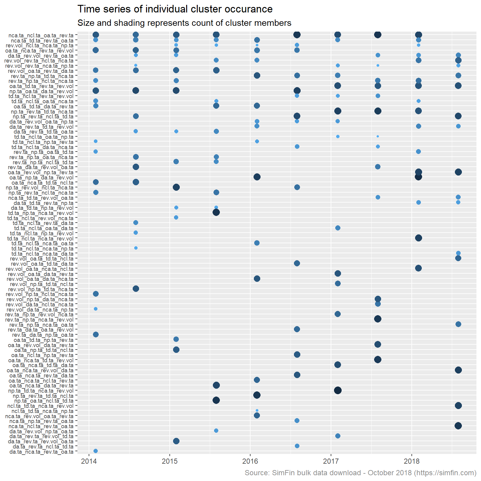
The plot above shows that cluster membership is driven by different attributes at different points in time. There are a total of 83 individual clusters over the ten assessment dates . Had there been no variation in cluster formation at each assessment date the plot above would list 16 clusters only. The largest number of stocks in any one cluster is 114, the smallest is 13.
Moving on, we need to join are cluster assessment back to the original monthly data set. The code block below joins the cluster labels to the monthly data set and then fills forward the cluster membership.
# Join tables
simfin.m <- simfin.m %>% left_join(kclust16.tot, by = c("me.date", "Ticker", "SimFin.ID")) %>%
  mutate(year_half = semester(me.date)) %>%
  group_by(Ticker, year_half) %>% fill(td.ta.data:withinss) %>% ungroup()
Step 4 - For each date and cluster, fit the PB-ROE model and rank stocks based on the resultant valuation
I first learned about the Price/Book - Return on Equity (“PB-ROE”) model reading this blog. The intuition of fitting a regression line to determine the relationship between return on equity and valuation, and then using deviations from this relationship (the residual from this regression) to determine relative valuation of stocks seemed simple and a common sense approach. After all, if some stocks in the same industry (or having the same financial characteristics in our example) have a higher ROE, they should be more valuable.
The code block below creates the required inputs to the PB-ROE model, fits the model to each cluster at each date, and then joins this data back to our main dataframe simfin.m. This block of code relies heavily on the nesting functionality in the purrr package.
simfin.pbroe1 <- simfin.m %>%
  # Price to book rato and ROE
    mutate(ROE = Winsorize(ann.NetProfit / TotalEquity, probs = c(0.02, 0.98), na.rm = TRUE),
           PB = Winsorize(mkt.cap / TotalEquity, probs = c(0.02, 0.98), na.rm = TRUE),
           logPB = if_else(PB <= 0, log(1), log(PB))) %>%

  # Discard attributes not required
  select(Ticker, SimFin.ID, me.date, logPB, ROE, clust.name) %>%

  # Retain only valid records
  na.omit() %>%

  # Remove bad data created with application of log transform
  filter_all(all_vars(!is.infinite(.))) %>%
  filter_all(all_vars(!is.nan(.))) %>%

  # Nested data frame
  group_by(me.date, clust.name) %>% nest() %>%

  # Fit linear regression / PB-ROE model and return residuals
  mutate(
    fit = map(data, ~ lm(logPB ~ ROE, data = .x)),
    tidied = map(fit, tidy),
    glanced = map(fit, glance),
    augmented = map(fit, augment),
    resids = map2(data, fit, add_residuals)
  )

# Data frame of PB, ROE and model residuals
simfin.pbroe <- simfin.pbroe1 %>%
  unnest(resids)

# Join to monthly data frame
simfin.m <- simfin.m %>% left_join(simfin.pbroe) %>%

  # Add percent rank of residual
  group_by(me.date, clust.name) %>%
  mutate(PBROE.rank = percent_rank(desc(resid))) %>%
  ungroup() %>%
  rename(PBROE.resid = resid)
The newly added attributes to our data frame are labelled PBROE.resid and PBROE.rank. PBROE.resid is the difference between the actual log price book ratio and that inferred by the return on equity. If the residual is a positive then stocks are considered overvalued, the actual price to book ratio is larger than that determined by the model. Likewise, a negative residual indicates undervaluation based on our model. PBROE.rank is a descending percent ranking of the PBROE.resid. A value of 1 is the lowest residual (undervalued) and a value of nil is the most overvalued.
Lets inspect the results of the regression. Below is a plot of the log Price / Book ratio and ROE for each cluster as at December 2017.
# Average r squared of regression model
r.sq <- simfin.pbroe1 %>%
  unnest(glanced) %>%
  select(me.date, clust.name, r.squared) %>%
  group_by(me.date) %>%
  summarise(r.squared = mean(r.squared))

# Scatter plot of sample
labs <- simfin.m %>% filter(!is.na(clust.name), me.date == "2017-12-31") %>%
  group_by(clust.name) %>%
  filter(PBROE.resid == max(PBROE.resid) | PBROE.resid == min(PBROE.resid)) %>%
  select(Ticker, me.date, clust.name, logPB, ROE, PBROE.resid) %>%
  ungroup()

simfin.m %>%
  filter(!is.na(clust.name),
         me.date == "2017-12-31") %>%
  ggplot(aes(x = logPB, y = ROE)) +
  facet_wrap(~clust.name, ncol = 5) +
  geom_point() +
  geom_text(data = labs,
            label = labs$Ticker,
            check_overlap = TRUE,
            size = 3,
            nudge_x = 0.4) +
  geom_smooth(method = lm) +
  labs(title = "PB-ROE model by fundamental cluster",
     subtitle = "As at December 2017",
     caption = "Source: SimFin bulk data download - October 2018 (https://simfin.com)") +
  theme_grey() +
  theme(strip.text = element_text(size = 7),
        legend.position = "none",
        axis.title.x = element_blank(),
        axis.title.y = element_text(color = "darkslategrey"),
        plot.caption = element_text(size = 9, color = "grey55"))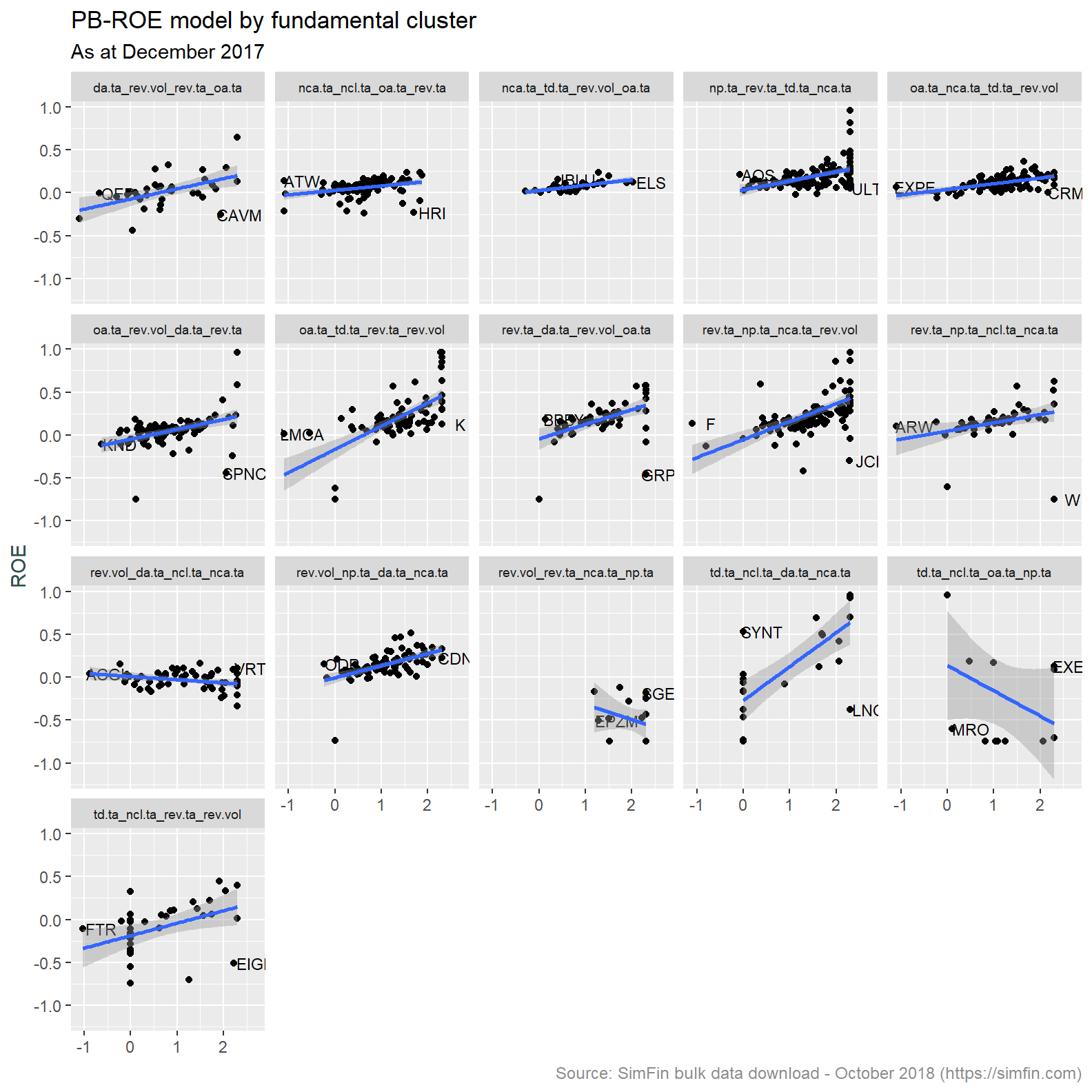
We expect to see an upward sloping line as the P (price or market capitalisation) in the logPB increases with greater ROE (return on equity). This is primarily what has been observed. A few clusters do have an inverted relationship and low number of individual observations. This is likely due to noise in the underlying data creating idiosyncracies in both the clustering and regression algorithms.
Step 5 - Apply the Merton distance to default model and rank stocks by probability of default
The Merton distance to default model assesses the credit risk of a company by modeling the company’s equity as a call option on its assets. Put another way, the model compares the value of assets to that of liabilities. It is considered a structural model because it provides a relationship between the default risk and the capital structure of the firm. A good summary of the model is provided here.
The Merton distance to default model has been modified in the Merton for dummies paper. It is this simplified version that we will implement.
As always, firstly we need to prepare data for ingestion to the model. The three inputs are market capitalisation, debt and equity return volatility. Previous analysis has used both market cap and total debt, we have that data available. We have not calculated equity volatility thus far. This is calculated below.
# Price - filter attributes and dates required
simfin.d <- simfin %>% filter(Indicator.Name == "Share Price" & publish.date > "2011-12-31") %>%
mutate(me.date = ceiling_date(publish.date, unit = "month") - 1) %>%

  # Group and remove Tickers with sufficient days data to satisfy rolling function
  group_by(Ticker, SimFin.ID) %>%
  mutate(date_count = n()) %>% filter(date_count > 60, !Ticker == "") %>%

  # Create daily returns and rolling volatility
  mutate(rtn = log(Indicator.Value)-lag(log(Indicator.Value)),
         vol_3m = roll_sd(rtn, n = 60, na.rm = TRUE, align = "right", fill = NA) * sqrt(252)) %>%

  # Roll up to monthly periodicity
  group_by(Ticker, SimFin.ID, me.date) %>%
  summarise(vol_3m = last(vol_3m),
            SharePrice = last(Indicator.Value)) %>%
  ungroup()

# Join to monthly data frame and fill foward
simfin.m <- simfin.m %>% left_join(simfin.d) %>%
  group_by(Ticker, SimFin.ID) %>% fill(vol_3m) %>%
  ungroup()
We now create the distance to default measure and assign a descending percent ranking thereof (MertonDD.rank).
# Create Merton DD
simfin.m <- simfin.m %>%
  mutate(MertonDD = if_else(TotalDebt == 0 | vol_3m == 0, 25,
                       log(1/(TotalDebt / (TotalDebt + mkt.cap))) /
                       (vol_3m * (1-(TotalDebt/(TotalDebt + mkt.cap))))),
         MertonDD.rank = percent_rank(desc(MertonDD)))
A MertonDD.rank value of 1 is the highest value of distance to default, these are stocks that are unlikely to default and hence have low credit risk. Likewise, lower values of MertonDD.rank represent stocks with smaller distance to default and higher credit risk.
Step 6 - Combine the rankings of the valuation and default models, and assign an ECL and risk stage
In the introduction we stated that stocks that have a low valuation and/or a high default risk will attract a higher estimated expected credit loss. We therefore need to combine our ranking and come up with a single measure with which to apply an ECL and risk stage. The code block below takes the average of our two percent rank measures (PBROE.rank and MertonDD.rank), ranks the result and assigns an ECL on the scale implicit in the case_when statement below.
simfin.m <- simfin.m %>%
  group_by(me.date) %>%
  mutate(avg.rank = (PBROE.rank + MertonDD.rank) /2,
         comb.rank = percent_rank(avg.rank)) %>%
  ungroup() %>%
  mutate(
    cover = case_when(
      comb.rank >= 0.95 ~ comb.rank * 0.50,
      comb.rank >= 0.85 ~ comb.rank * 0.40,
      comb.rank >= 0.75 ~ comb.rank * 0.30,
      comb.rank >= 0.65 ~ comb.rank * 0.20,
      comb.rank >= 0.45 ~ comb.rank * 0.10,
      comb.rank >= 0.25 ~ comb.rank * 0.05,
      TRUE ~ comb.rank * 0.025
      ),
    ECL = cover * TotalDebt,
    RiskStage = case_when(
      comb.rank >= 0.8 ~ 3,
      comb.rank >= 0.5 ~ 2,
      TRUE ~ 1
      )
    )
Let’s have a look at couple of stocks. The code below filters for stock tickers beginning with “AA” and extracts information as at quarter end dates post 2016.
simfin.m %>%
  filter(
    me.date %in% c(
      as.Date("2017-03-31"),
      as.Date("2017-06-30"),
      as.Date("2017-09-30"),
      as.Date("2017-12-31"),
      as.Date("2018-03-31"),
      as.Date("2018-06-30")
      ),
    str_detect(Ticker, "^AA")
    ) %>%
  select(Ticker,
         Date = me.date,
         'Risk Stage' = RiskStage,
         'Fundamental cluster' = clust.name,
         'Total Debt' = TotalDebt, ECL) %>%
  arrange(Ticker, Date) %>%
  mutate_if(is.numeric, round, digits = 0) %>%
  datatable(
    rownames = FALSE,
    options = list(
      pageLength = 10,
      columnDefs = list(list(className = 'dt-center', targets = 0:5))
      ),
    escape = FALSE
  ) %>%
  formatCurrency(
    c("Total Debt", "ECL"),
    currency = "",
    interval = 3,
    digits = 0,
    mark = ","
    )
\(~\)
An observation reviewing the data extracted above. It is apparent changes in cluster membership cause unexpected changes in the risk stage and ECL balance. For example AAPL has moved cluster membership between December 2017 and March 2018. Accompanying this movement is a significant increase in ECL balance. This does not seem correct, AAPL fundamentals have not changed during this period. My natural inclination is to understand the “why” behind this change in modelled ECL balance. For now I am going to leave this. This post is already getting too long. Having said that, debugging the results we see is an important skill and something I will come back to.
Conclusion
The analysis above has created an ECL and risk stage for our imaginary banks loan portfolio. This data will be used to prepare the tables highlighted in the first post of this series. That will be done using data analysis tools in both Python and R. The aim is to be proficient in both of these languages.
We have gone down a rabbit hole in deriving these attributes and that is intentional2. The whole idea here is to practice modelling techniques with a real world dirty data set. Dealing with outliers, missing data and inconsistent data is large part data science / data analysis. There is no point shying away from that reality.
I am yet to find a way to correct the formatting of tables produced using the kableExtra package. They should look something like this. Instead, I end up with something similar to that demonstrated here. Stack overflow tells me there is a whole lot of messing with CSS code required to get that sorted out. Not having the time for that, the tables produced by the DT package will do for now.↩
We could have easily assigned an ECL by multiplying the loan balance by a random number between say 0.5 and 0.05.↩