This post is going to analyse the momentum effect in US stocks using both publicly available aggregate data, and privately collected individual stock level data.
The momentum effect is the tendency for stocks that have gone up (down) in the past to continue going up (down) in the immediate future. Going up or down in the past is usually defined as the prior 12 months returns and is measured on a relative basis. A traditionally formed momentum portfolio takes a long position in stocks that are in the top decile of prior returns, and a short position in stocks in the bottom decile. Those stocks are held for a month, and portfolios are reformed as the constituents of the extreme deciles change. Note that the effect as defined cares only about returns in the cross-section. If all stocks in the market are positive, or negative for that matter, this is irrelevant for the long and short leg formation process.
There are couple of aims to this analysis:
Compare a bottom up creation of momentum portfolios to the industry standard definition thereof,
Confirm if the long and short legs perform equally, and
Analyse the returns to the momentum effect, specifically looking at its relationship with market volatility, and its co-variation with economic growth and interest rates.
The first point is important as I would like to use the longer time series of the public data to model the momentum effects behavior. If my custom implementation exhibits a significant similarity over the period in which both series overlap, I can be confident in applying whatever inference has been learnt from the long series to the short series.
Data overview
The publicly available data comes from Ken French’s Data Library. The data is presented as returns to 10 portfolios formed by ranking prior 12 month returns. The universe of stocks is those listed on the NYSE, AMEX or NASDAQ exchanges with sufficient historical data. This data is pre-aggregated in that only portfolio level data is presented. Individual stock level data is not available with this source. I will refer to this data as the public data set.
The stock level data is collected with the Alpha Vantage API and stored in my Stock Master database. I am assigning stocks into deciles each month in order to form momentum portfolios similar to that described above. The universe is the top 1,000 stocks by a combined rank of total assets and equity. Data cover the period form 2012 to 2020. I’ll refer to this data as the custom data set.
Both data sets have a monthly frequency.
Custom data
Cumulative returns
We start plotting cumulative returns to a momentum strategy constructed using individual stocks returns. Both a traditional and truncated approach is included, this is explained further below.
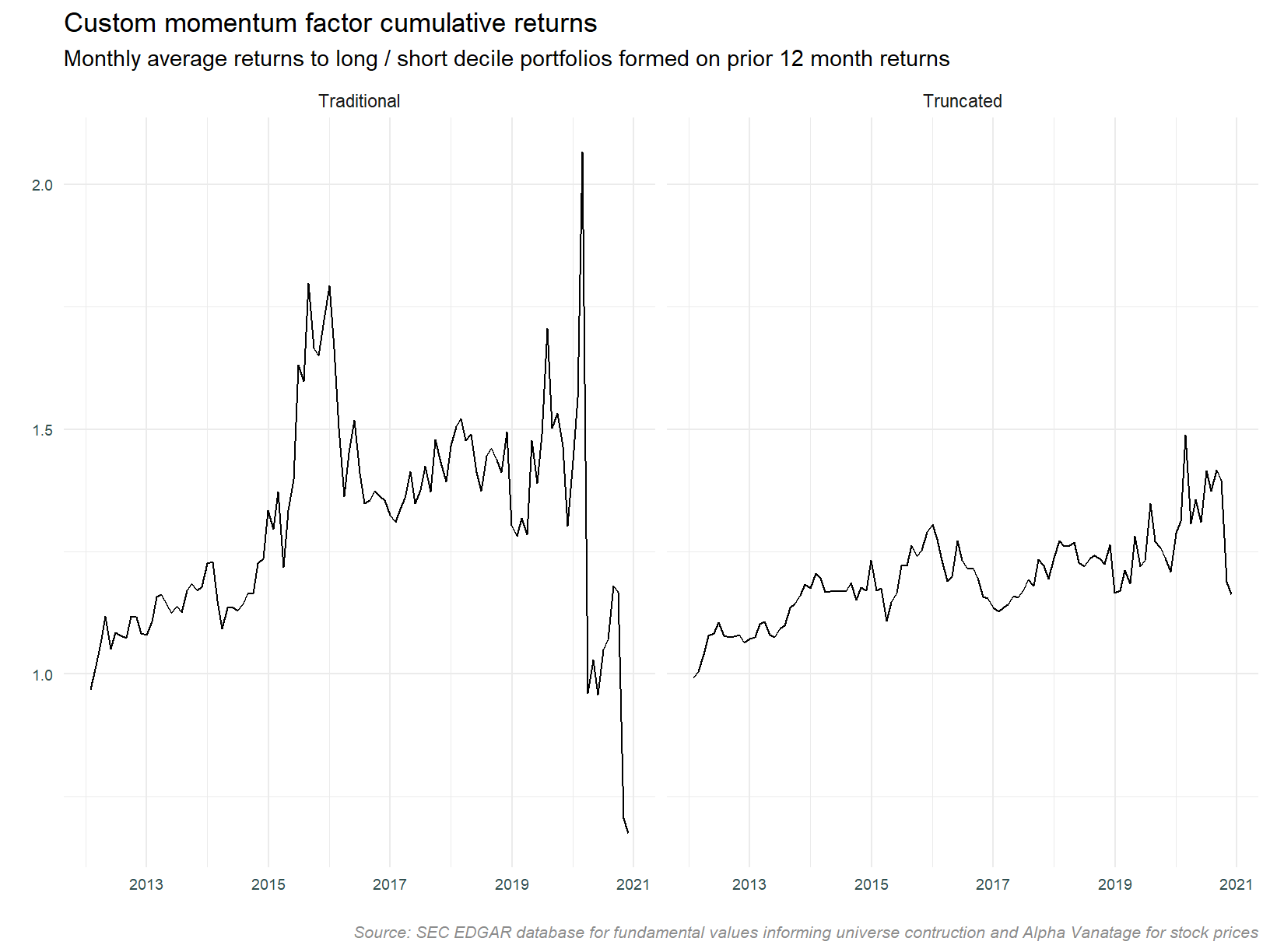
The plot above contains two implementation approaches. Consistent with the description above, the traditional approach takes stocks in prior return deciles 1 and 10 as short and long portfolios. The truncated version ignores the extreme deciles and is calculated using deciles 2 & 3, and 8 & 9. Both approaches trim 5% of observations from the upper and lower values of monthly returns prior to computing the mean monthly return. The truncated version has been included on the suspicion that the traditional approach may contain spurious data and / or very small stocks with high volatility. The high volatility in the traditional approach suggests this may be a possibility. There is certainly some extreme movement in early and late 2020.
The table below contains the first and tenth decile portfolios returns for February, March and October of 2020. These are the months with the very large absolute returns. Decile 1 is the short portfolio and decile 10 the long. Note that these are raw returns, a negative return in decile 1 (the short portfolio) represents a gain. These stocks are shorted.
Digging deeper, we look at the top 10 constituents of these portfolios for each month.
There are some very large moves in these portfolios. Those investigated check out. For example CDEV (Centennial Resource Development) appeared in both the February and March short (decile 1) portfolio. This stock returned -89% (the price moving from 2.37 to 0.236) in March and 349% (0.236 to 1.18) in April. A momentum strategy including this stock would be short in a month in which the return was 349%.
Price data has been included to provide an indication of implementability. Very low priced stocks are often not available for shorting, or even available to trade. The decile 1 and 10 portfolios are likely to include these type of stocks, and the data above bear this out. In light of this, we will continue to analyse the truncated portfolio methodology, this being a more realistic implementation approach.
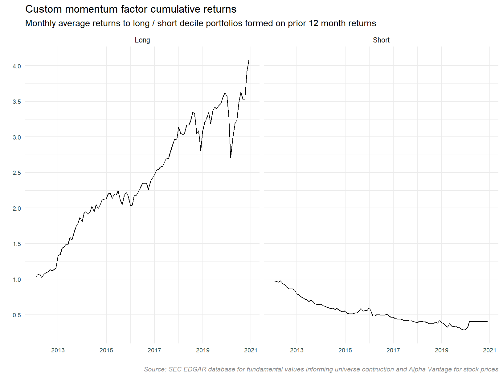
Separating long and short legs
The plots above show the aggregation of long and short portfolio legs. We can of course look at these individually. Looking at the component legs to the strategy individually will give us an idea as to what is driving returns and volatility. Which leg is contributing most to returns? Which leg is contributing most to volatility? Does combining legs reduce volatility?
The plot below separates the long and short legs. Note the differing scales across each of the portfolio types.
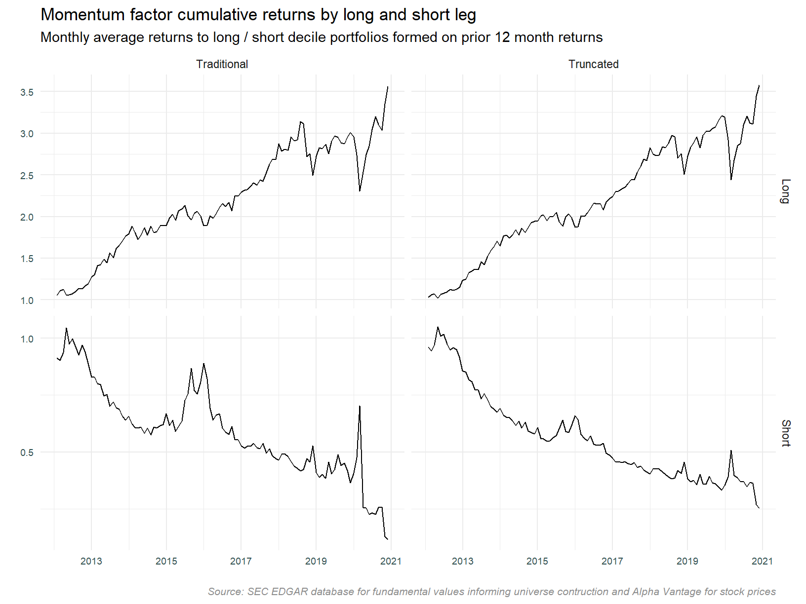
It’s quite obvious the short leg is not contributing to the profitability of the strategy. Eyeballing the plot suggests it may be reducing the aggregate volatility however, notice the large draw downs in the long portfolio that are offset by the spikes in the short portfolio.
Scatter plots
Looking at cumulative returns to a strategy is informative and gives us a high-level view. Plots of cumulative returns are particularly good at calling out draw downs. They may hide some relationships of interest however. Let’s look closer at the relationship between prior and future returns using scatter plots.
In the scatter plot below we standardise prior 12 month and forward 1 month returns at each date. The scale therefore represents the distance from the mean in standard deviations. The colors highlight long, short and neutral portfolios based on prior 12 months return. Long and short portfolios are the three extreme terciles (i.e. the traditional plus truncated versions). The fitted line is a GAM smoother, and although the noise in the data obscures it, it is independently fit for each bin.
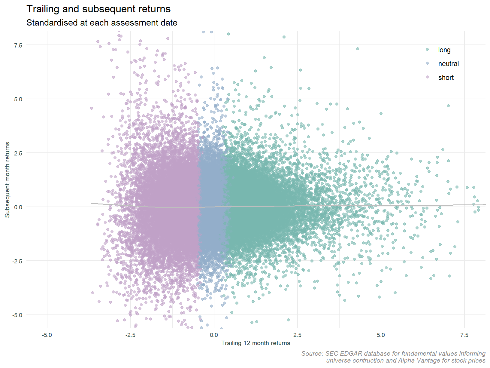
This plot confirms the pattern observed in the analysis of cumulative returns. The long leg is working for us, the short leg less so. Subsequent month returns are positive for the short leg. Since the strategy shorts these stocks, the leg is not profitable. The plot also highlights the low signal to noise ratio. The fitted lines deviation from the mean is barely perceptible.
Conditioning on volatility
Controlling for volatility has been shown to enhance momentum strategies. One of the findings of the linked study is that weighting the investment in the strategy so as to equalise expected volatility enhances returns. This scaling takes account of the fact that past volatility is negatively correlated with future returns. Let’s see if we can see this effect at individual stock level. Below, the plot presented above is faceted by individual stock volatility. Trailing 6 month volatility of daily returns is binned into terciles over the full time frame1.
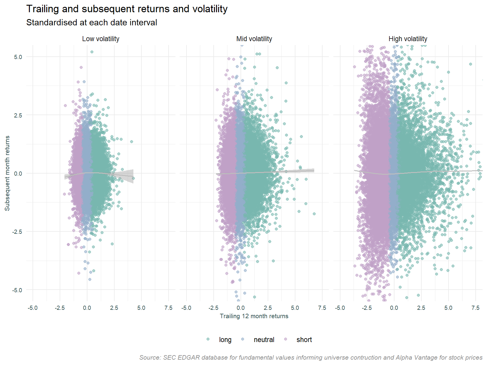
It looks like we only see the short momentum effect in low volatility stocks, it is only this portfolio that has negative (scaled) returns. Another observation is that the low volatility group has lower returns to the long leg compared to both the mid and high volatility groups. Let’s follow up on this point and construct a strategy where the short leg accepts only low volatility stocks while the long leg is unconstrained.
This strategy has certainly improved the performance of the short leg, but at the expense of the extremely profitable periods that reduce aggregate volatility.
At this point we will finish with the analysis of individual stock data and note a couple of points. The negative returns to the short leg, and the characteristic of periods in which large draw downs to the long leg are offset by high profitability in the short leg.
Public data
We now compare the results derived from a bottom up approach using personally acquired data, to the public aggregate data set.
Firstly, an important point in relation to portfolio formation. The custom data set forms portfolios (i.e. creates the decile breakpoints) at month t and records at month t the subsequent returns for period t to t +1. The public data set forms portfolios at month t -1, and records returns for the period t -1 to t. In order to make these series comparable, a month lead is applied to the public data. In addition to this, the public data excludes the most recent month from the returns used in assessing momentum. This is the approach used in the original paper identifying the momentum effect. This different formation approach remains.
The portfolio data is aggregated on an equal weighted basis so as to be comparable to the custom portfolios. Likewise, a truncated approach is used to mitigate the impact of extreme returns. While I don’t expect data errors to result in outliers to the same extent as in the custom data, given the expanded universe2 and inclusion of many more smaller capitilisation stocks, extreme returns are to be expected.
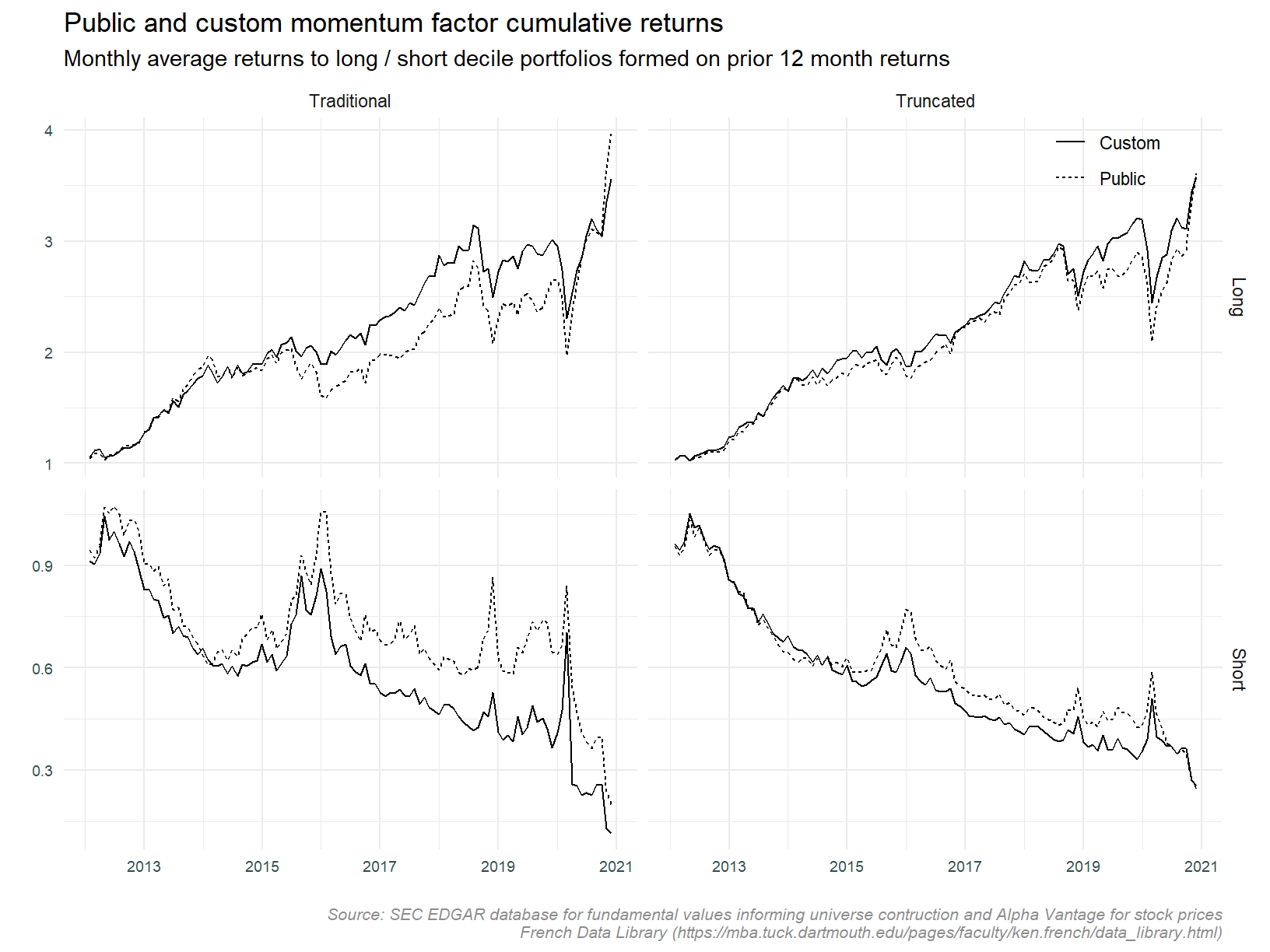
Cumulative returns
We will start comparing cumulative returns across data sets.
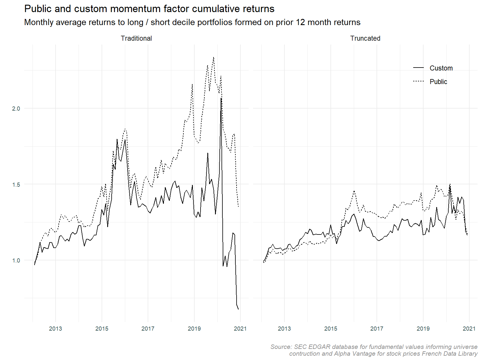
The overall pattern in cumulative returns is similar across the custom and public data sets. The magnitude of returns differs in the latter half of the series especially for the traditional approach. We can see the series drift apart during the 2017 to 2019.
Looking at the long and short legs separately.
The series look much more alike when separated into long and short legs. The short leg appears to be the main driver of the differing returns. As expected, the two data sets appear more alike when constructed using the truncated approach.
The table below shows the full period volatility of each of the series.
Consistent with the plots, the difference in volatility between the truncated portfolios (custom versus public) is lower than that of the traditional portfolio.
Can we rely on the similarity between the public momentum and custom momentum portfolios to such an extent that they are substitutable? If so, we can use the longer public data set to test characteristics of the strategy which can then be implemented using the custom data. Eyeballing the truncated data suggests the answer to that question might be yes.
Correlations and volatility
Before we conclude, lets look at the correlation between series and compare volatility in more detail. First, correlations.
The plot below shows the correlation between the custom and public data sets by period (pre 2017, post 2017 and the full series), and by strategy leg (long, short and combined).
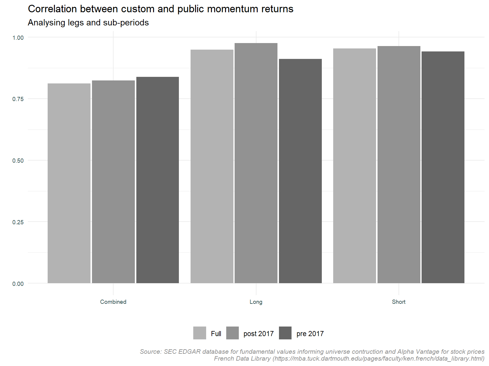
Observations:
1. The correlation between the traditional and truncated approaches for the long and short legs is greater than that for the combined strategy,
2. The correlations are consistent across sub-periods,
3. The correlations are high, in the 90% range.
These observations are consistent with the cumulative return plots above. Nothing presented here would make us change our mind as to the substitutability of these series.
Now comparing volatility, the plot below compares the average monthly volatility across the same facets described above.
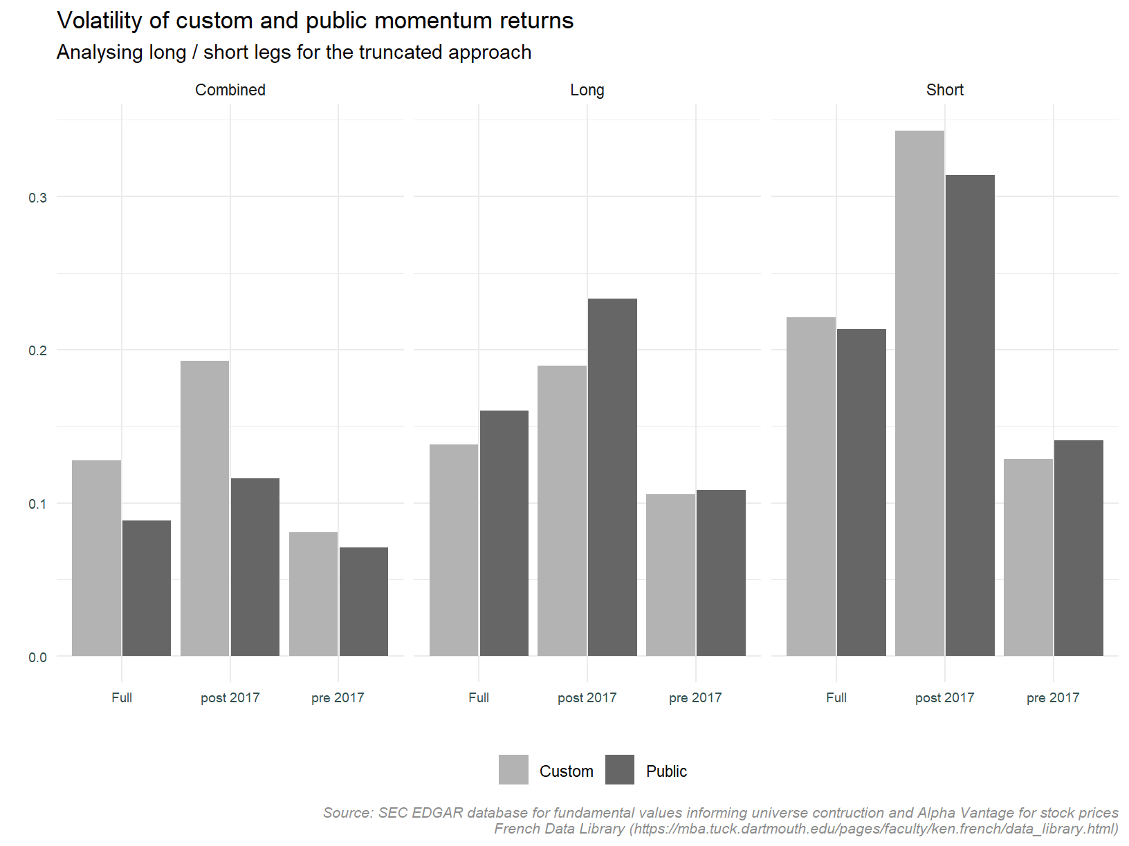
The immediate observation is the high volatility of the short leg post 2017. This is consistent with the initial cumulative return plots presented above. The volatility differential between the custom and public data is not significant except for the combined strategy post 2017. The short leg is driving this difference.
Based on the visual similarity, the similar correlations, and similar volatility, we close this portion of analysis concluding that the two truncated portfolios (that derived bottom up from the custom data, and that constructed from the public data) are sufficiently alike so as to use the public data set as a proxy for the custom data set.
Let’s now turn to analysing the public data in its entirety.
Public data - full series
The analyse thus far has been limited to periods for which the custom data is available (post 2012).
The public data set covers the period from 1930 to present. It is this that we will now look at with the caveat that analysis will be limited to the post 1950 period. We will focus on a period more closely resembling the current era.
This section will explore this data in a similar manner heretofore; looking at returns to each leg and inspecting portfolio returns and volatility. Co-variation with macro variables will also be addressed.
First we plot cumulative returns for the aggregate strategy, and also for each leg.
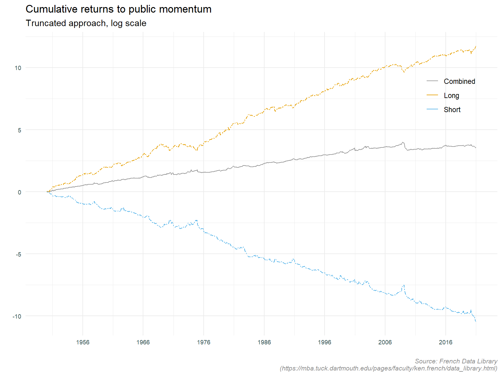
This calls things out in pretty stark terms. The over all strategy is profitable but the divergence between the long and short legs is huge. Why even both with the short leg? Research has shown that it is predominately the long leg driving returns for number of equity factors, see When equity factors drop their shorts for example. So while the sign of the returns to each leg is to be expected, the magnitude is surprising. At this stage it is worth pointing out that traditionally defined factors are weighted by market capitalisation and are first sorted on size. From the data library explanation of the momentum factor:
"We use six value-weight portfolios formed on size and prior (2-12) returns to construct momentum. The portfolios, which are formed monthly, are the intersections of 2 portfolios formed on size (market equity, ME) and 3 portfolios formed on prior (2-12) return. The monthly size breakpoint is the median NYSE market equity. The monthly prior (2-12) return breakpoints are the 30th and 70th NYSE percentiles.
Momentum is the average return on the two high prior return portfolios minus the average return on the two low prior return portfolios."
I suspect the short leg of the portfolio defined above will have better performance than the truncated equal weighted portfolios created for this analysis. The small high volatility stocks that are a return drag have a smaller impact in market capitalisation weighted portfolios.
Other significant observation include the large draw downs in 1975 and 2008; the largely consistent positive returns (driven by the long leg); and the period in the early 70’s when the short leg offset the long legs losses, thus contributing to aggregate profitability.
Trailing volatlity
We revisit volatility as a conditioning factor on momentum returns. The analysis of the public data will focus on trailing volatility of market returns (proxied by the S&P 500 index), as opposed to individual stock returns within the portfolio under analysis. Remember, the public data does not contain individual stock returns so we cannot do this. The plot below shows momentum strategy returns and trailing 20 day volatility.
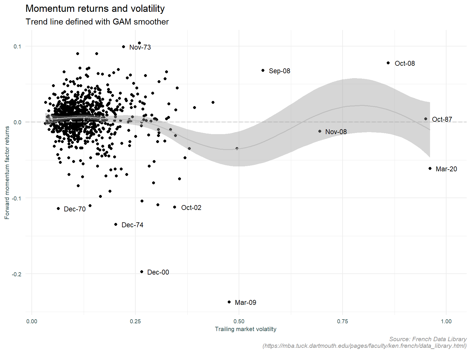
The smooth regression line suggests a tendency for momentum portfolio returns to be negative following periods of high volatility. We can see that the regression line become negative once volatility exceeds 25%. Note also the outlying data points. It is interesting to note that the returns in October 1987, the month of the Black Monday crash are unremarkable.
What about by long and short leg?
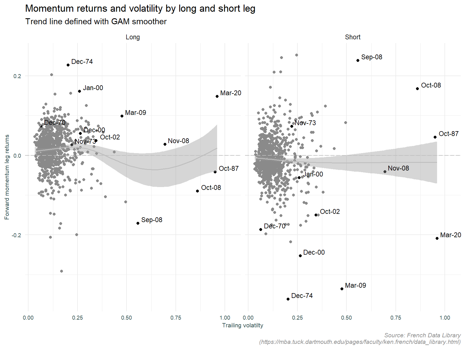
It is now apparent the effect of trailing volatility differs across legs. Moving from very low to average volatility increases returns for the long leg. It is then only as volatility increases further do returns decrease. Whereas for the short leg, as volatility increases, returns decrease monotonically. This appears to be in contrast to the individual stock data which suggest low volatility stocks in the short portfolio deliver positive returns. A lot needs to be done to tease out the various effects driving this observation, and that is beyond the scope of this analysis.
The observations above raise a couple of questions. It would be interesting to compare returns to the standard truncated strategy with returns to the same strategy conditioned on prior month volatility. The chart below does this, if prior month volatility is greater than 25%, the strategy stays out of the market.
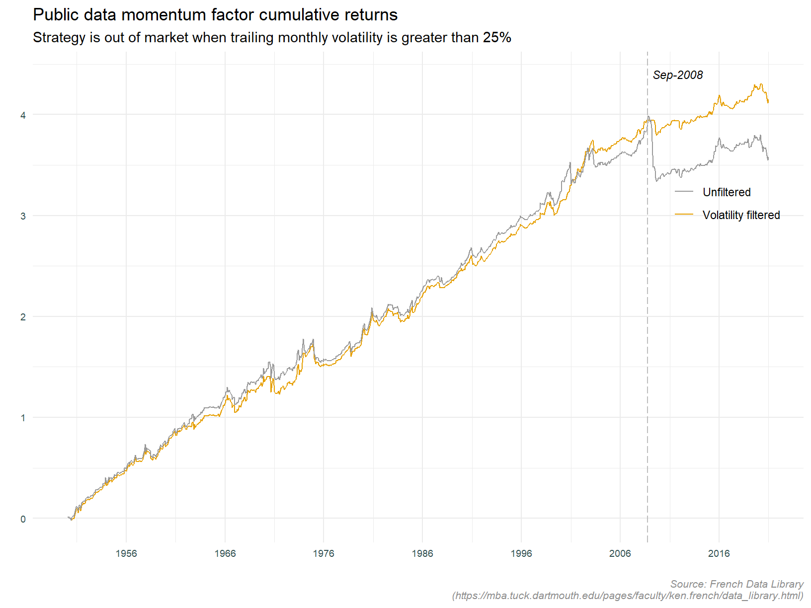
That would have gotten us out of a pickle during the financial crisis during September 2008 (with a bit of hindsight of course!), but is not helping anywhere else.
Lets apply the same concept, but conditioning on the long and short legs individually.
We will indulge ourselves and optimise the volatility filtering rule iterating over different cut-off values. Why an indulgence? Again, we are peaking into the future here. This is not a valid analysis should we wish to rely on these rules going forward.
The optimal volatility cut-off for the long portfolio is 0.35, and for the short portfolio 0.05. This very low filter effectively turns the short portfolio off. Not surprising given what we now know about the short leg. This may not be the optimal approach should it’s inclusion lower overall portfolio volatility, or put another way, if its diversification benefit raises the sharpe ratio.
As an aside, it would be interesting to determine if using daily trailing volatility of the momentum portfolio returns (as opposed to market volatility) is a better timing indicator. This is doable, daily data is available in the French Data Library, however for now we will leave this exercise for another time.
Back to the point at hand, below is plot of the optimised portfolios referred to above.
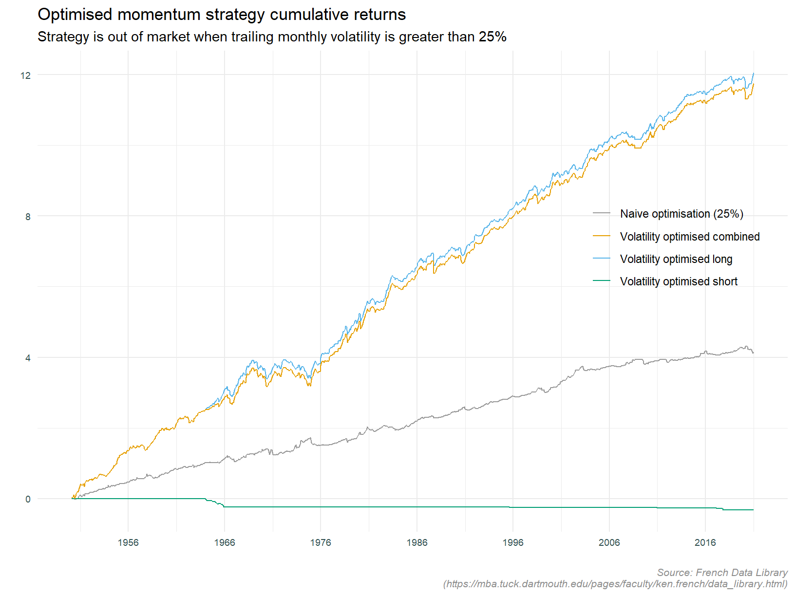
The short leg speaks for itself. As stated, since it is delivering negative returns, the goal seek has set the filter at such a low level as to effectively disallow investing in this portfolio. The line labelled Naive optimisation (25%) is the same as that labelled Volatility filtered in the preceding plot. It is pretty obvious applying a volatility filter to the long strategy is optimal.
At this point I am going to finish the analysis on volatility, concluding with the point that volatility filtering can enhance the long leg, but not save the short.
Covariance with macro variables
Most studies that look at some type of “factor” or “anomaly” in the stock market, look at co-variation with macroeconomic variables. I am not going to go into a lot of detail here. Rather, a couple of high level plots investigating obvious relationships appearing at first pass. We will look at economic growth and interest rates. You can of course go to town with this sort of thing and other variables usually include financial conditions, credit growth, consumer sentiment, etc.
Economic growth
I’m going to use the CFNAI diffusion index to proxy for economic growth. The CFNAI index is:
“a weighted average of 85 existing monthly indicators of national economic activity. It is constructed to have an average value of zero and a standard deviation of one. Since economic activity tends toward trend growth rate over time, a positive index reading corresponds to growth above trend and a negative index reading corresponds to growth below trend”
The CFNAI diffusion index is:
“calculated as the sum of the absolute values of the underlying indicators whose contribution to the CFNAI is positive in a given month less the sum of the absolute values of the weights for those indicators whose contribution is negative or neutral, expressed as a proportion of the total sum of the absolute values of the weights”
The upper panel of the plot below shows cumulative returns to the truncated momentum strategy shaded with periods in which the forward 6 month return is less than negative 20%. We are calling out forward draw downs with this plot. The aim is to identify times when we do not want to be invested in the strategy. The lower panel has the same shading as the upper panel, this time over the Chicago Fed National Activity Index (CFNAI) diffusion index. The idea is to highlight potential relationships between the state of the index and forward returns.
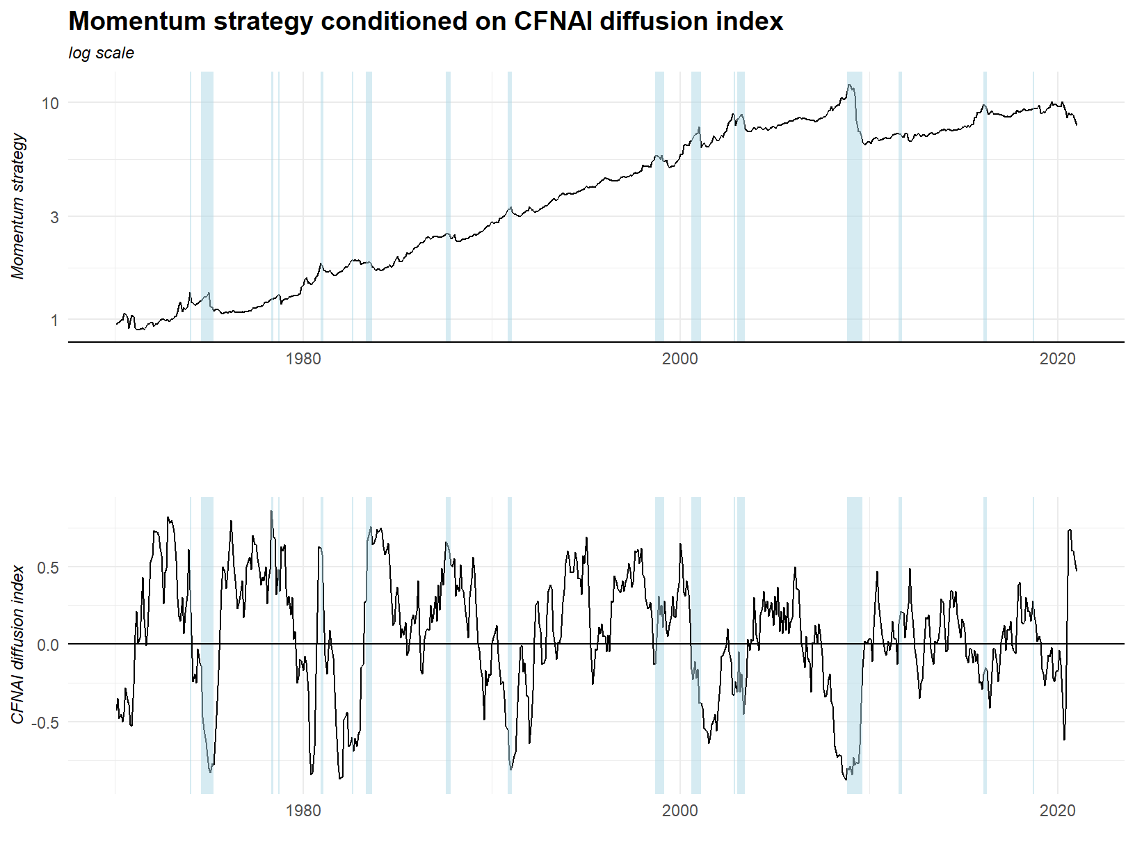
It is pretty hard to find a discernible pattern here, but we might say troughs in the CFNAI index tend to precede large draw downs.
Next, let’s see if discretising the CFNAI into equal frequency bins can help elucidate relationship between the series. The plot below has 18 facets. Let’s start with the top 6. These represent bins defined as the intersection of periods when the CFNAI level is considered high, low or medium; and when its 6 month change is either positive or negative. The following two rows are the same bins lagged 6 and 12 months. The density plots show the returns when the series is in the bin specified, and all other times. The value labeled KS pvalue is the p value derived from the two sample Kolmogorov-Smirnov test. The intuition behind this approach is to tease out potential non-linearities and interaction effects that a traditional regression model may miss.
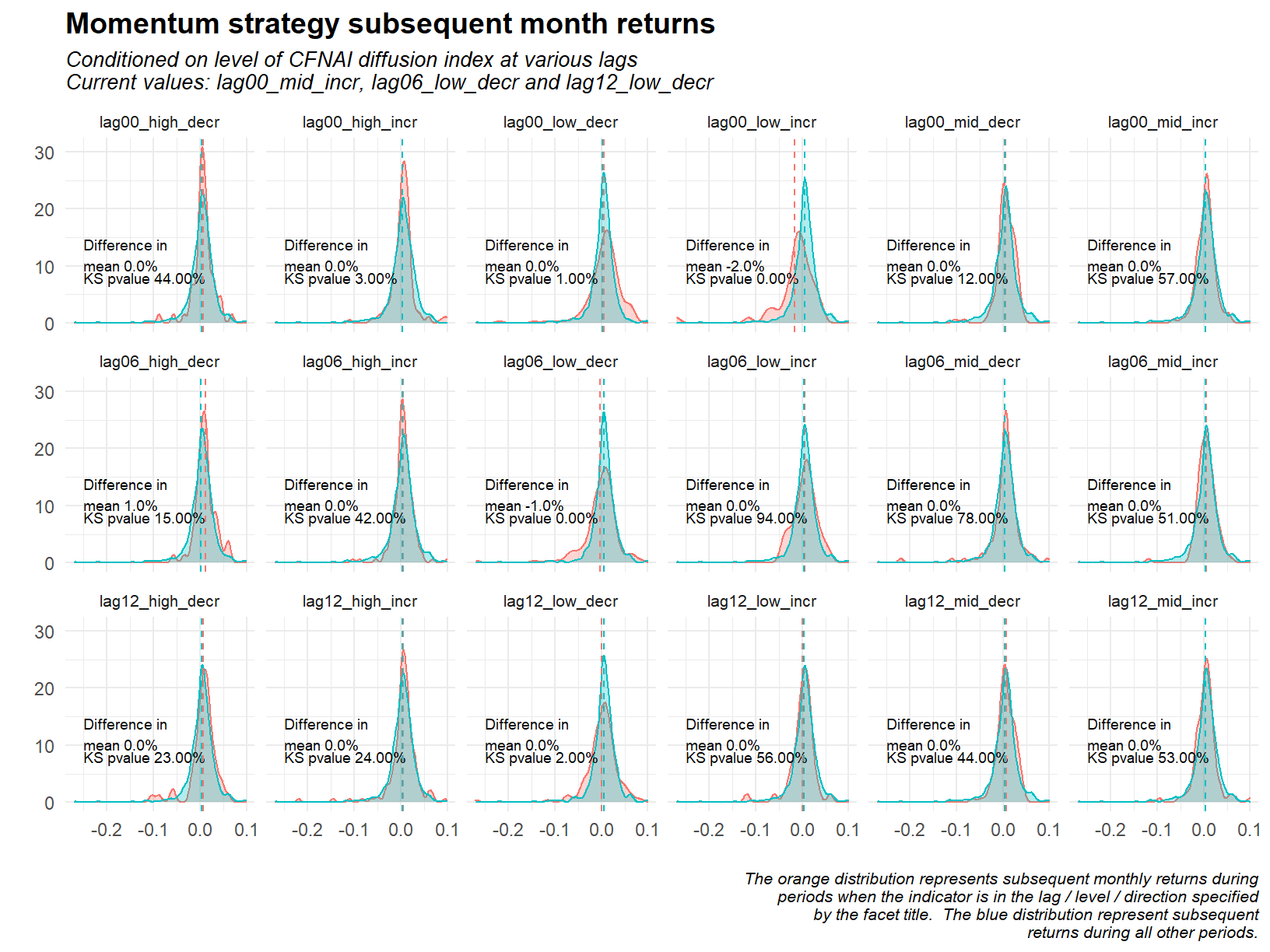
The one significant facet above is that highlighting periods when the un-lagged CFNAI index is low and increasing (top row, four across). When the market is in this state the subsequent monthly returns to the momentum strategy are 2% lower than at all other times. This appears consistent with the time series analysis in that the very large draw down in 2008 coincides with the CFNAI index increasing from a very low level. It is possible that this single data point is driving the result seen.
Interest rates
The plot below shows the momentum strategy and yield spread. The yield spread being the excess of the 10 year treasury rate over the 2 year treasury rate.
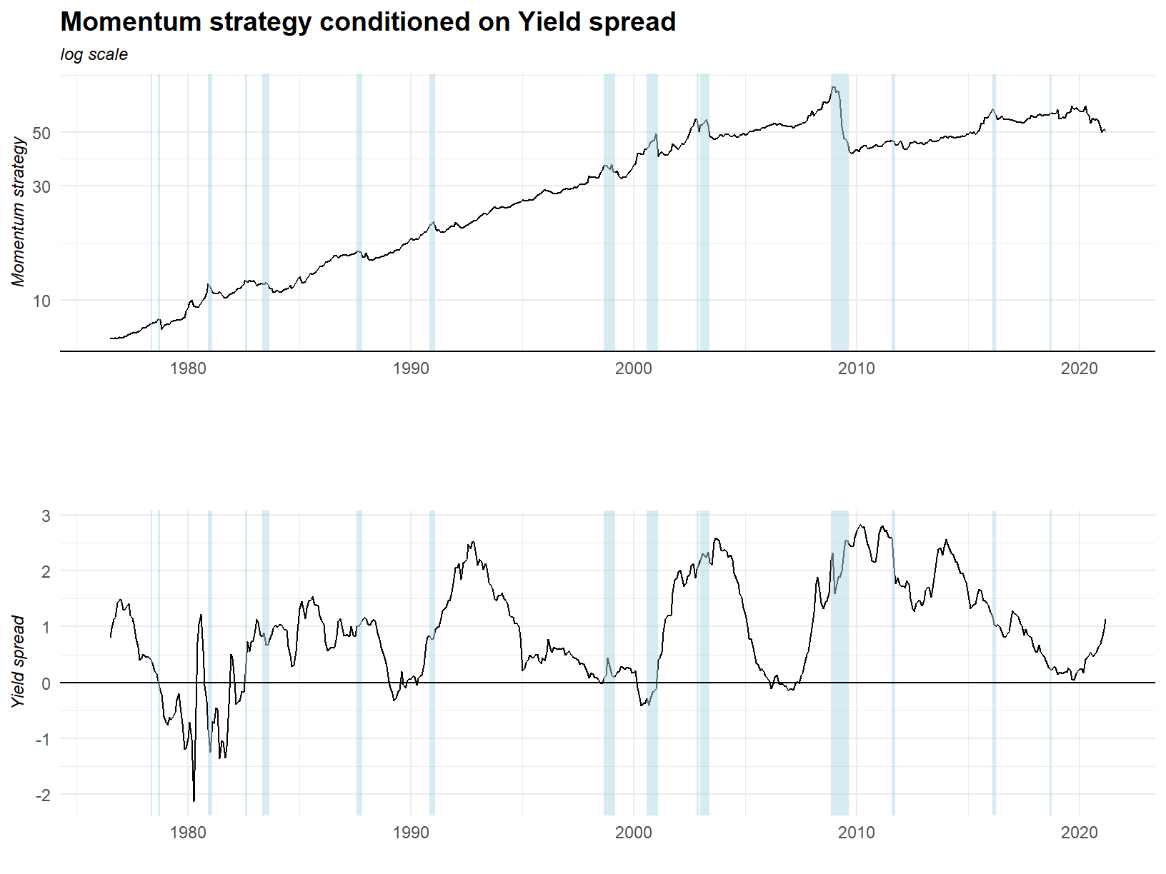
If anything we might say the major draw downs occur only when the yield spread is rising. The relationship seems to be quite weak.
Now to the density plots of subsequent returns.
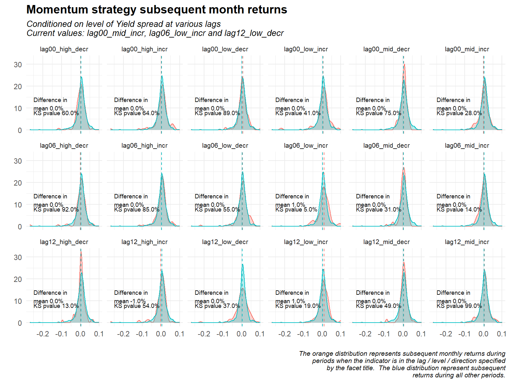
As suspected, very little in the way of a significant relationship with the exception of one facet. Periods with low and increasing yield spread lagged 6 months (second row, four across) has historically seen 1% higher forward monthly returns than other times. This is a weaker effect than that observed with the CFNAI index, the difference in mean is smaller and the p value is higher. I wonder if this represents periods that correspond to the last part of bull markets? An increasing yield curve is traditionally a signal of recession and bull markets typically go exponential before recessions drag them down.
Conclusion
I set out to answer couple of questions with this analysis.
First, compare a bottom up creation of momentum portfolios to the industry standard definition thereof. Are these substitutable? The answer to this is yes, with a few caveats. We must use a truncated portfolio construction technique, discarding the two end deciles. We must also use equal weighted returns. Why is it that only after using these specific portfolio construction techniques are the data sets similar? This is due to the different investable universes available for each data set. The custom data contains the top 1,000 stocks by size (measured with accounting variables, assets and equity). In contrast the public data set is a much expanded universe, essentially all US stocks. Different combinations of volatile stocks lead to different returns, and I suspect the end portfolios embody this more than other decile portfolios. What about the requirement for equal weighting? This is simple, I haven’t gone to the trouble of constructing weighted returns for the custom data.
Second, do the long and short legs of the momentum strategy perform equally? This is a clear cut no. The short leg is rarely profitable, the long leg consistently so. A little more nuance to this would point out that there are periods when the short leg offsets losses in the long.
Last, how does the momentum effect co-vary with economic growth and interest rates. Using the CFNAI index as a proxy for economic growth, we see that the momentum strategy performs poorly when the CFNAI index is low and increasing. A weaker relationship is observed with the yield spread, periods with a low and increasing lagged yield spread see slightly higher forward returns.
Over the course of the above analysis we also examined volatility as a conditioning factor on momentum returns. Filtering out low volatility stocks in the cross section, and filtering the time series implementation so as to invest only during low volatility periods both enhanced returns. How these effects interact requires further analysis.
Limitations & further investigation
There are of course limitations to any analysis. The investigation of momentum portfolios has been that of an exploratory data analysis, there has been no inference from explanatory variables or prediction into future returns. The binning approach to assessing macro variable is a rather rudimentary technique, and should form only a starting point for more detailed analysis. Bins make interpretation easy but throw away information. See the notes at the bottom of this post discussing same.
Further investigation. I suppose your imagination is the limit here. From my perspective, a few points of interest. Further investigations might look at regressing both legs of the momentum portfolios against the macro variables, market volatility and the strategies trailing volatility. Using the volatility of daily returns of the public data set may provide better signals in this type of regression. The comparison of custom and public data sets could be extended to look at the similarity between series as measured by Dynamic time warping. Lastly, we could compare the market capitalisation weighted and equal weighted end decile portfolios of the public data set in order to determine if small capitalisation stocks are contributing to the volatility of these portfolios.
Bonus
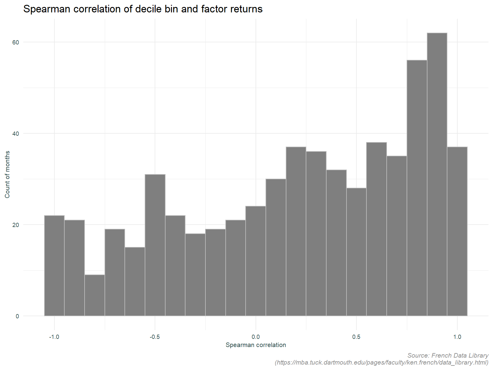
The analysis below doesn’t fit neatly anywhere else in this post. I thought this might be interesting however. Here we look at the monotonicity of the momentum deciles. Are returns increasing with each decile? This is assessed using the Spearmans rank correlation between returns to each of the deciles and the decile bin number.
Presented without comment.
Inherent in this approach is a look-ahead bias. Data from 2020 is being used to determine quantiles in 2012. Not something that can be done in real time. For this exploratory analysis, our “back of the envelope” approach will suffice.↩︎
The public data is not limited to the top 1,000 largest stocks like the custom data.↩︎